
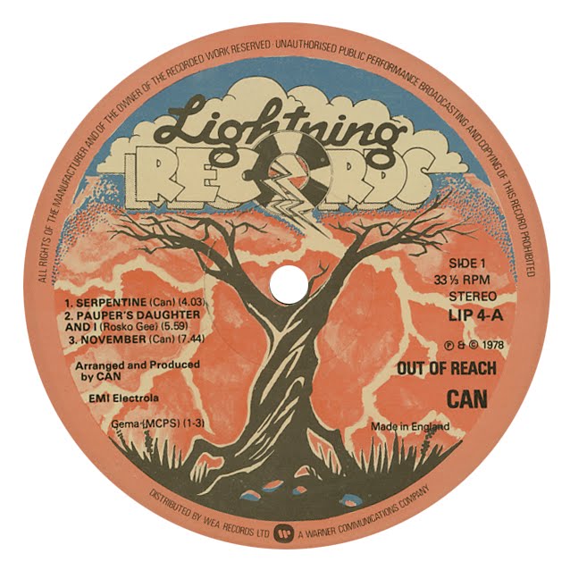
 My initial inspiration for this blog was noticing hand-drawn images and hand-colored compositions on labels, both things that are somewhat rare approaches in graphic design today. This label sums up some of the qualities that I love about that approach - a fun, cartoony font with idiosyncrasies (the S in "records" seems to be missing the bottom inner loop,) a weird stippled gradient between the orange and blue, and a cool (as in, elaborate-doodle-on-a-10th-grader's-notebook cool) drawing of a gnarly tree. Plus, check out that lighting!
Friday, May 7, 2010
Lightning (1978)
My initial inspiration for this blog was noticing hand-drawn images and hand-colored compositions on labels, both things that are somewhat rare approaches in graphic design today. This label sums up some of the qualities that I love about that approach - a fun, cartoony font with idiosyncrasies (the S in "records" seems to be missing the bottom inner loop,) a weird stippled gradient between the orange and blue, and a cool (as in, elaborate-doodle-on-a-10th-grader's-notebook cool) drawing of a gnarly tree. Plus, check out that lighting!
Subscribe to:
Post Comments (Atom)
No comments:
Post a Comment