Showing posts with label 23 Chris Royalty. Show all posts

Sunday, December 26, 2010

Grand Funk - Shinin' On b/w Mr. Pretty Boy (Capitol, 1974)


Both the frustration and the promise of record collecting is that there are sooooo many records in the world - rare records to discover, classics to make your own, favorites to keep coming back to. And its that same inexhaustible nature that thwarts any attempt to truly be a completist.

It's in that spirit that I post my last record - one that I don't remember how I got and one that I'm sure I've never even listened to. But damn, that is a hell of a cool label.

Thanks Alexander - this has been fun!

Thursday, December 23, 2010

New Order - Power, Corruption & Lies (Factory, 1983)


I bought this in my hometown shortly after college from a thrift store that benefits Habitat for Humanity. LPs were only $.50 - I still consider this the best cost-to-quality purchase of my entire life.

This scan is from the Canadian pressing, which, like the UK edition, wisely omits "Blue Monday."

Wednesday, December 22, 2010

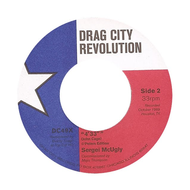
Mayo Thompson - Woof b/w 4'33 (Drag City, 2008)


7" inch that came with the reissue of Thompson's full-length wonder "Corky's Debt to His Father." Side A is a terrific spry snappy instrumental jam (also released on a Red Krayola singles comp); side B is a cover of the John Cage classic. Crucially, it's not simply silent grooves, but four minutes of room tone, cars outside, and accompanying atmosphere.

It took me a while to realize that the label art isn't a minimalist reinterpretation of the American flag, but instead a cropped version of the Texas flag. Patriotic either way.

Monday, December 20, 2010

Zs - Hard EP (Three One G, 2008)


One-sided 12" that plays at 45 rpm. Side A is a single taut and skronky 15 minute composition; side B is an etching of the John Dwyer (Thee Oh Sees) cover art, pressed on rich medium gray vinyl.

Sunday, December 19, 2010

Kraftwerk - The Man Machine (Capitol, 1978)


Kraftwerk more or less wins label design with this one.

Saturday, December 18, 2010

The Slits - Cut (Antilles, 1979)


Island Records logos are frequently the ugliest. While I like the bubble-script-minor-league-baseball vibe of the Antilles logo, the Island visual elements ruin this - the centerhole disrupts the illusion of the sun (now it looks more like the Tropicana orange), and the palm tree looks like a synthetic buoy floating on a thin ocean by itself.

But somehow the inclusion of the band's name and silhouette redeems the label overall for me - it's charming and goofy rather than heinous.

Wednesday, December 15, 2010

The Alps - Le Voyage (Type Records, 2010)


These labels don't just look like the cover; they also look like the album sounds. A review somewhere described "Le Voyage" as a fake soundtrack to a European travel film, and that's apt not just because of the title. Expansive but not endless, each cut more of a set piece than a "song", varied from track to track but related as a whole, pleasant but also a bit emotionally removed. This record has snuck up as one of my favorites from this year.

The labels are blow-ups of the similarly indistinct sleeve images. Though the album's production is clear and precise, there's still a slight fog on some tracks, a soft distortion around the edges or the equivalent a medium film grain, and the label art reflects that nicely. The labels relate to the cover without simply duplicating the same image on a smaller scale, and the art relates to the sound in a non-literal manner. Lovely usage of Futura medium too.

Gang of Four - Entertainment! (EMI, 1979)

Tuesday, December 14, 2010

Public Image LTD - Album (Elektra 1980)

An aspect of record design I intend to explore here over the next week(s) is the relationship between cover art and label design. It's odd that "Raw Power," "Bitches Brew", and "Blood on the Tracks" all look the same - but it makes more sense that Talking Heads and Ramones share the same Sire label.

On one hand, there's a sense of continuity - despite the changes in styles over time, each work is part of a modernist continuum, an addition to the catalog of human achievement. And there's also a legitimacy conferred - "this is like that", so it's going to be similarly good. But then fundamentally, they sound different and look different on the outside; why don't they look different on the inside?


"Album" (or "Cassette" or "Compact Disc" [unfortunately it's listed as "Album" on iTunes, and not "Download") exemplifies a close relationship between the cover and the label. There's no mistaking which sleeve this goes in. I love its literalism. I also particularly appreciate how the songs are subjugated to the album - on the the sleeve, the tracklisting is a small row of single words separated by commas. This object is not "Collection of Songs" or "The One with Rise" - it's "Album."

Monday, December 13, 2010

? and the Mysterians - 96 Tears/Midnight Hour (Cameo 1966)

The clearest musical memories of my childhood revolve around Dire Straits' "Money for Nothing" video, a Beach Boys cassette tape we listened to on family vacations, and my dad pointing out the piss-stained monolith on the cover of "Who's Next." It would be only a slight exaggeration to say that my interest in records stems from that last moment.

In that spirit, I'm going to begin my time at this blog with a song I remember clearly from my childhood. Whenever this came on the radio, my dad would impress on me how cool it was that the guy's name was a symbol. Greil Marcus said this should be our country's national anthem.

This copy actually belongs to my mother-in-law; we were digging through her records last Christmas and she graciously loaned this to me.