Showing posts with label 09 Kent Lambert. Show all posts

Sunday, May 30, 2010

Shrug Records (2007)


I bring my stint at Collector Not Completist to a close with a plug for my band Roommate's vinyl label Shrug Records and a few associated friends... This soundtrack to Jim Finn's breakthrough film Interkosmos features a gorgeous matchbook sleeve designed by Dean Rank and printed by Jeff Mueller at Dexterity Press. Dean designed the artwork for two Roommate releases, and the LP label was as important to him as any other element of the artwork. He really outdid himself with this one here.

Thank you Alexander for inviting me to post to this most excellent blog!

Saturday, May 29, 2010

Columbia (1993)

Mercury Rev's Yerself Is Steam is one of my favorite albums of the 1990s, and I'm a big fan of the 10" vinyl format, so I was excited to find this relic at Encore Recordings in Ann Arbor. I was curious to know how faithful this faux-vintage design is to actual Columbia Grafonola Symphony Series LPs of the early 20th century, and some googling took me to this page--I'd say this 1993 10" is a decent but perhaps not quite satisfying facsimile of the original?

Friday, May 28, 2010

United Artists (1968)

Here's another record I rescued from my dad. I have a few United Artists records, and none of their labels are particularly dazzling, but I do very much dig the UA logo on this one. If I want dazzling I look no further than this LP's paper sleeve:

Thursday, May 27, 2010

Bestline Products Inc. (1973)

Since I devoted four days of posts to my mom's Japanese 45s, I figured I'd post a label or two from my Dad's record collection. This one is a true oddity from the brief period when he worked for Bestline Products, a pyramid scheme of a company that suckered scores of people into selling crappy cleaning products door-to-door and attending expensive conventions with motivational speakers and lavish award ceremonies. This LP is an artifact of one of those conventions, complete with gatefold and 10-page color booklet. This was probably the last of such conventions, as Bestline's pyramid came crashing down later that year.

I'll admit that I've never listened to the record (I'm pretty sure it's just recordings of a weekend's worth of motivational speeches), but I find its label to be surprisingly attractive. I love that the lowercase A is the biggest thing on the entire label.

Wednesday, May 26, 2010

Victor (1967)

My mom went to a Yukio Hashi concert during her 1967 Tokyo trip and bought a few of his 45s, including this morsel. This and a couple of her other Japanese 45s include an unusual physical design feature: the 45 RPM adaptor is built into the 45. When I briefed Alexander on this one he asked "I wonder if people were supposed to snap that thing out to use an adaptor?" Upon close examination I concluded that it's a permanent feature--you'd need a serious blade or tool to remove the thing.

This A-side ("Koi No Mexican Rock") is by far my least favorite song of these Japanese 45s, but I sure love its sleeve:

Tuesday, May 25, 2010

King Records (1969)

Once again, silver and red pair spendidly. Need I even point out everything else that makes this label so delicious? Big thanks to my sister-in-law for confirming the release date of this 45 and for locating a recording of its A-side on YouTube.

Monday, May 24, 2010

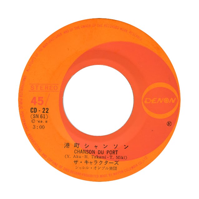
Denon (1969)

I was under the impression that all of the Japanese 45s in my mother's collection were from a trip to Tokyo in the summer of 1967, but considering its 1969 copyright, she must have picked this one up on a subsequent visit. The music is blissful 60s pop with male and female vocals and a touch of enka melodic stylings. Not unlike its sublime label art, it spins like a soft, cool breeze on a hot summer day.

Sunday, May 23, 2010

Minoruphone (1967)

My mother was born and raised on the tiny island of ChiChi Jima, far off the coast of Japan. In 1967, after graduating from an American high school on Guam, she visited mainland Japan for the first time. She picked up some 45s in Tokyo, and I rescued them from her several years ago. This is the first of four labels I'll be posting from her collection of Japanese 45s. I love the silver/red color combo and the graceful layout (especially the way it incorporates five-line staves).

Saturday, May 22, 2010

Lo Recordings (2001)

These labels aren't nearly as stunning to me as those in my first post, but I like the way each side gets its own layout scheme and the way the hole is incorporated into the design.

Friday, May 21, 2010

Kemado (2007)

It seems like it's hard to go wrong with things that just look plain cool as they're spinning around.

Thursday, May 20, 2010

GDR (1974)

I tried very, very hard to get rid of the moiré pattern in this scan. I even followed the instructions in an online tutorial called "Moiré Go Away." But apparently the fine white concentric circles on this label are no match for the square pixels of a digital scanner. In some ways the moiré gives this image some extra razzle-dazzle, but if you can imagine the uniform white circles without the messy, swirly patterns overlaying them, you will imagine a deliciously sublime and elegant label. Moiré and circles aside, dig that fantastic 3D GDR logo!

Wednesday, May 19, 2010

Indian Records (1972)

One of my earlier memories is of being mesmerized by the dances and songs of some sort of Native American advocacy group who visited my elementary school in Colorado Springs, so I was excited to find this LP years later at Wax Trax in Denver. I love the tall skinny Indian Records font, and how about these drawings! What I wouldn't give to strut and dance atop a human-sized vinyl platter. Side 1 of this LP is all War Dance Songs. Me, I'm more of a Social Dancer.

(Note: I had a difficult time finding any information about this record including its year of release, but I eventually found it listed as a cassette in this article on the recordings of Plains Indians. )

Tuesday, May 18, 2010

Cadet (1968)

When I'm looking for a one way ticket to my happy place, I pull out this record. And just before I put the needle to it, I admire its label's tricolor font, blue gradient background and amazing radial stallion/sun logo.

(Note: I just found Alexander's post of an almost identical label. I almost took my post down, but I decided that the subtle differences between the two labels are worth noting--I much prefer the more muted colors of the Cadet font here, and I think the logo pops a little more as a filled-in shape rather than an outline. Still, I absolutely agree with Alexander that an ideal Cadet records label would be nothing more than "that logo, printed large and crisp, spinning around.")

Monday, May 17, 2010

Sähkö (2009)

How could I ever choose just one of these beauties? Oh, I have to? Side D.