 The color stripes on this are great.
The Meters albums on Josie are unreal, but the later ones, yeah right, no way.
 The color stripes on this are great.
 I really like the drawing of the building on this Mega label. It seems like the headquarters for something, probably a cabal of plotting businessmen in a superhero comic. Meanwhile, at the headquarters of M.E.G.A....
 Hey record collectors! How 'bout a one-way ticket to MAP CITY?
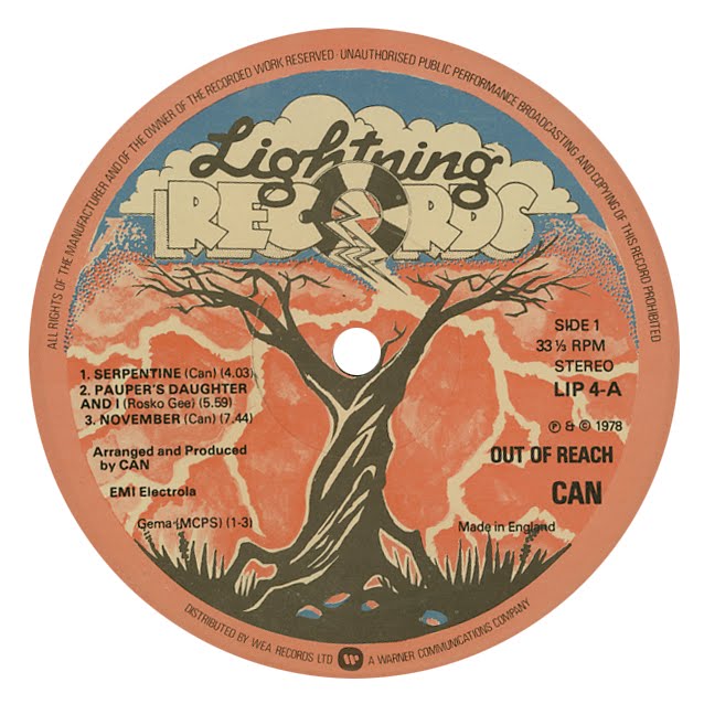 My initial inspiration for this blog was noticing hand-drawn images and hand-colored compositions on labels, both things that are somewhat rare approaches in graphic design today. This label sums up some of the qualities that I love about that approach - a fun, cartoony font with idiosyncrasies (the S in "records" seems to be missing the bottom inner loop,) a weird stippled gradient between the orange and blue, and a cool (as in, elaborate-doodle-on-a-10th-grader's-notebook cool) drawing of a gnarly tree. Plus, check out that lighting!
 The watercolor leaves on here are nicely done, although the text color is hard to read on the vivid background. Poppy put out Townes Van Zandt's records, as well as this fantastic album by the Mandrake Memorial, which has cool MC Escher cover art.
 This Kama Sutra label looks like packaging for a Barbie doll. I would probably like this label a whole lot more if the color scheme were tweaked away from the pink. Honestly, this Pepto-Bismol shade of pink really must be the hardest color for a designer to work with tastefully in the entire spectrum of visible color. Maybe there are some garish purples and sickly greens that could be as tricky, but I think this one is pretty tough. I do really like the layout with the arc of icons.
 I believe that Buddah Records was started by the same people who ran Kama Sutra, which explains why the multi-arm label icon is so similar. The border here looks like a nice piece of Spin-Art.
 The Buddah text and icon along the bottom are one of my favorite label layouts. The trippy background really makes this one. Funny that this is a soul compilation, but is graphically styled like a far-out pysch head trip.
 Great clouds and sky on this cheerful label.
 Now here's a nice design. I love seeing labels where the printed artwork plays off the turntable spindle.
 I'll follow up on Peter's "simple and direct" choice, but this is on the other end of the elegance spectrum from Jazzland. Design Records: Talk about a misnomer. Could there be any less design on this label? Actually, there definitely could be. After teaching enough visual design classes, I have learned that someone can always find a way to make it worse. The font here is very smartly done, and it's got a crisp, tasteful, less-is-more style. However, I think that if you choose to name yourself Design, you might try and produce more interesting design.


